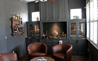
This room has lived a few lives.
 Originally, it was our home office; dark, moody, brand-forward. We painted the walls black, leaned into contrast, and built a space that felt sharp and focused. It served us well for a long time. But once we started working out of a dedicated office outside the house, this room… shifted.
It wasn’t pulling its weight as a workspace anymore — and instead of forcing it to stay what it used to be, we decided to let it become something softer.
The Shift
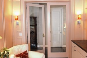
We started with paint — black out, blush in. Not just a color change, but a full color-drench: walls, trim, moulding, all in the same blush tone. The trim has a slightly different sheen than the walls, which gives the space a really subtle depth without breaking the calm, tonal vibe.
We also added box moulding all the way around the room, which instantly elevated the feel. It’s a classic detail, but in the same warm blush tone, it reads more modern and intentional than overly traditional.
The biggest layout change was closing off a few open walls and adding full glass French doors. Before, the room felt more like a wide hallway — just a pass-through on the way to the laundry room. Now, it’s its own space. Defined, calm, and actually enjoyable to be in.
 What Stayed
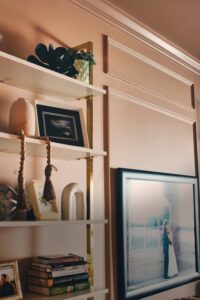
Not everything changed. The built-ins stayed as-is. They still work perfectly and added just enough contrast to ground the new palette. The floating shelves stayed too — they already fit the style we were heading toward, and sometimes the best design decision is not to overthink something that’s already working.
How It Feels Now
It’s no longer a space for hustle. Now it’s a space for slower mornings, quick breaks, sketching out ideas, or just sitting with a book and a coffee. It’s quiet, intentional, and warm — and it finally feels like it fits the way we live now.
If you’ve got a room that’s hanging onto its past purpose, don’t be afraid to reimagine it. You don’t need to tear everything out. A few thoughtful updates: paint, trim, and layout can completely shift how a room feels and functions.
Paint color, if you’re wondering:
We went with Setting Plaster by Farrow and Ball. It’s soft and warm without feeling overly pink — and the full color-drench really helped the moulding feel like part of the architecture, not just a detail on top of it.